HooBank
A conversion-focused homepage for a modern digital bank — built to earn trust in the first five seconds.
Visit live site(opens in a new tab)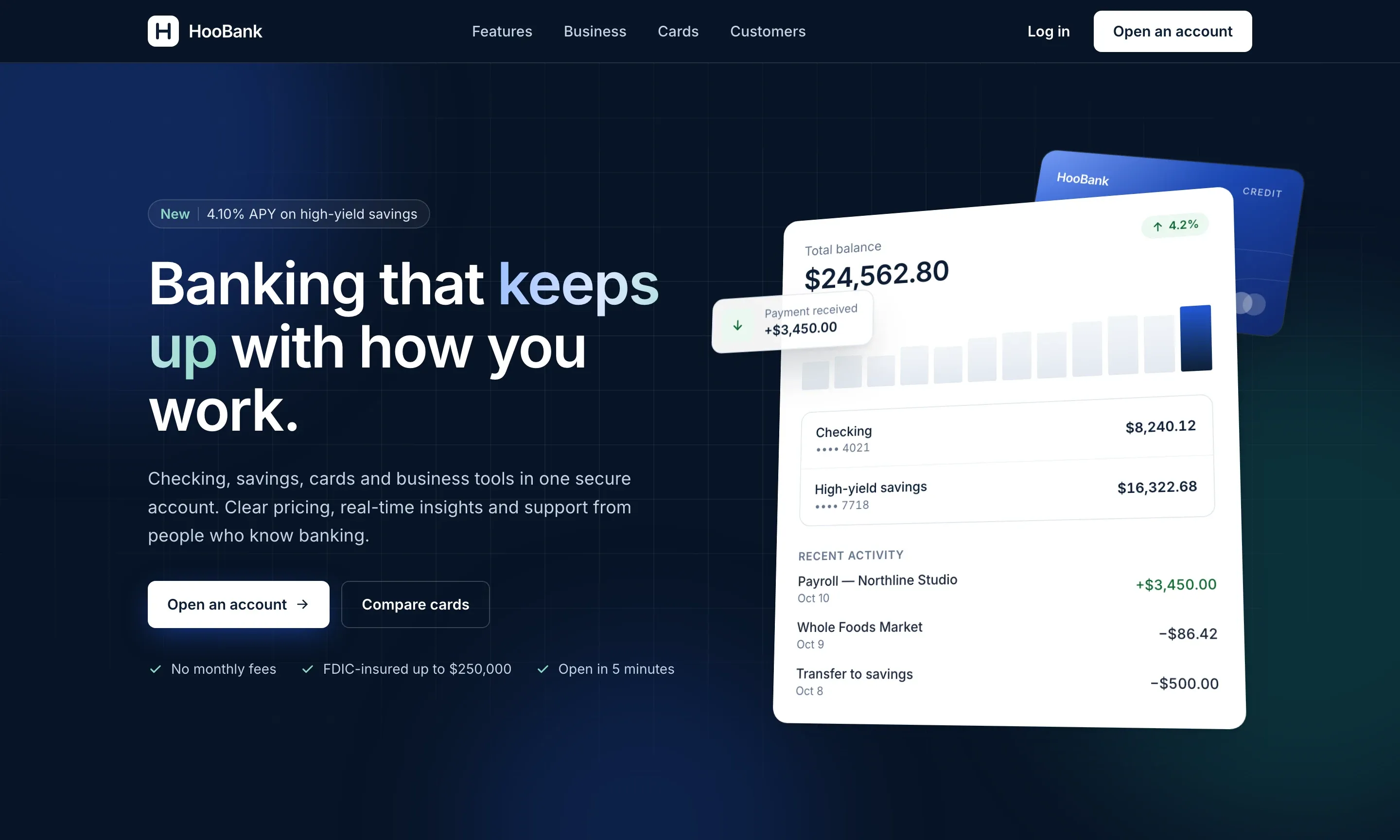
- Fintech landing page
- Fintech, UI Design, Development
- 2026
Before / After
Overview
In financial services, the homepage is the handshake. HooBank’s had to feel secure, modern and effortless at once — explaining the product clearly while giving visitors every reason to open an account.
We built a bold, dark interface with a strong typographic hierarchy, layered gradients and clear calls to action, structured around the questions new customers actually ask: what does it do, why trust it, and how do I start?
100%
Responsive, from small phones to wide desktops
Modular
Every section a reusable, data-driven component
1 page
One clear path from first visit to sign-up
How it’s built
Designed for trust
Security messaging, partner logos, testimonials and plain-language feature blocks are placed exactly where hesitation happens in a visitor’s journey.
Component architecture
Each section is a self-contained component fed from a single content file, so copy, features and stats can be updated without touching layout code.
Mobile-first layout
The layout was designed for phones first and scales up through fluid breakpoints, keeping calls to action visible and tappable at every size.
Lightweight by design
Optimised assets and utility-first styling keep the page small and fast, so the first impression arrives without a loading screen.
- Component UI
- Utility-first CSS
- Responsive design
- Performance
Let’s work together
Have something
worth building?
or write to hello@example.comBased in Seattle, WA — working with clients everywhere.